Updated 9th April 2022
This article has not been updated recently
Worries for Wales and London as cases rise


According to the ZOE COVID Symptom Study UK Infection Survey figures based on swab tests data from up to five days ago, daily new cases of COVID-19 across the UK are still falling, however, the number of cases in Wales and possibly London are now rising.
Key findings from ZOE COVID Symptom Study UK Infection Survey this week:
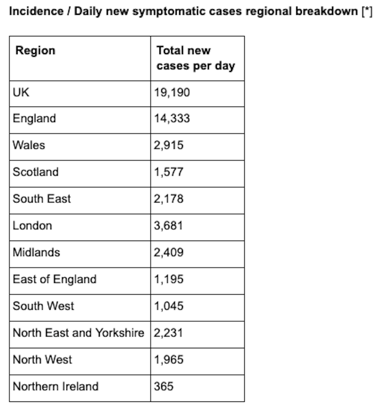
There are currently 19,190 daily new symptomatic cases of COVID in the UK on average over the two weeks up to 6 December (excluding care homes)
This compares to 20,497 daily new symptomatic cases a week ago
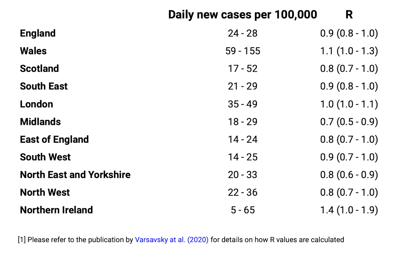
The UK R value is 0.9.
Regional R values are: England, 0.9. Wales, 1.1. Scotland, 0.8. (full table below)
Worryingly, in Wales, the number of daily new cases have been increasing since the last week of November
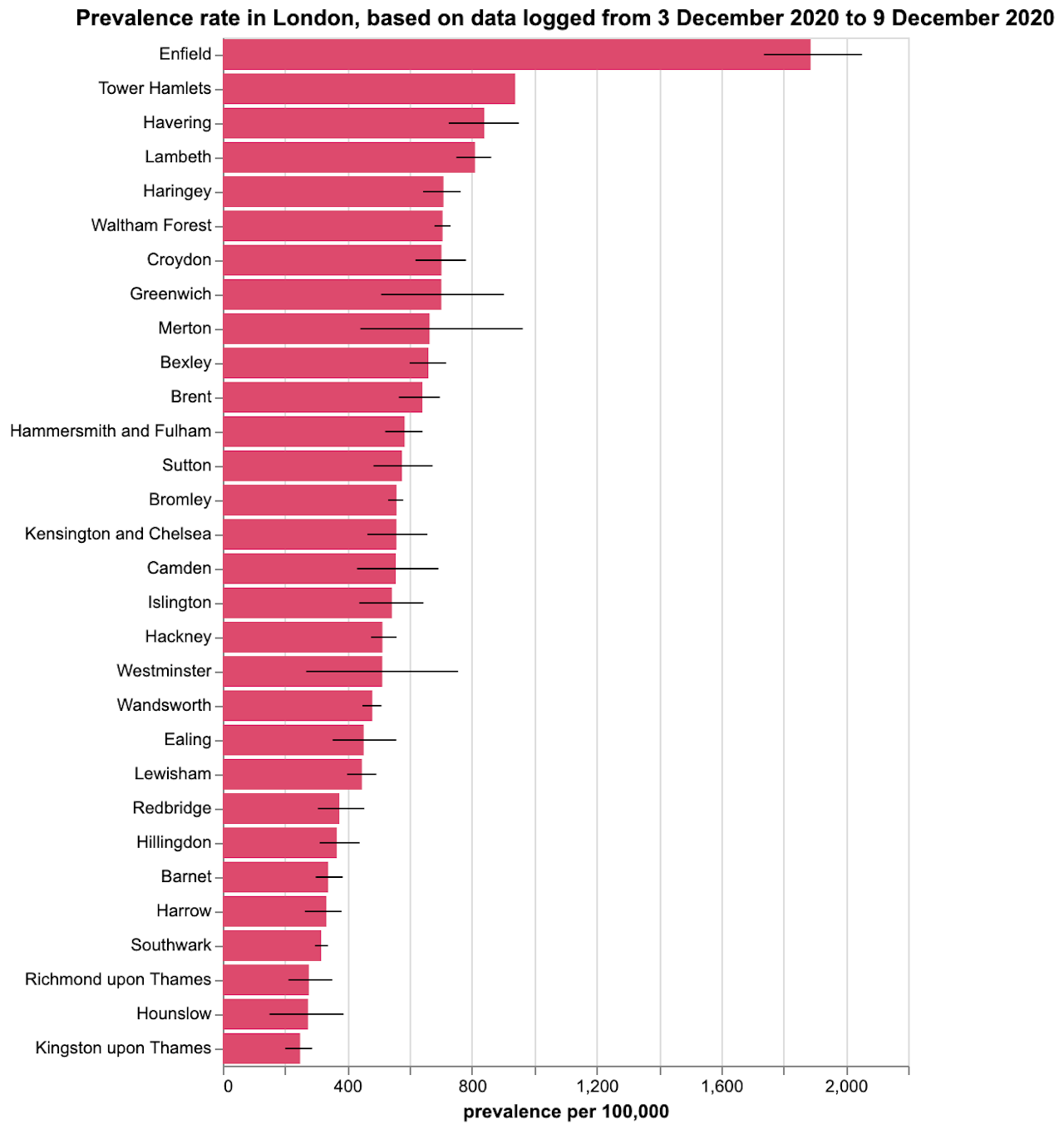
Across England, daily new cases are decreasing in all regions apart from London, which is the only area where cases are not going down, with an R value of 1.0. According to the data there are big local differences between boroughs, with six times more cases in Enfield than in Kingston upon Thames (see full table of regional results and graph below)
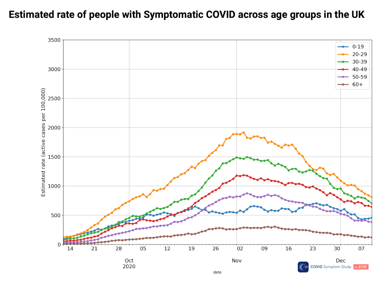
Age groups: cases in the over 60s that contribute to hospital admissions continues to slowly decrease over time (see graph below)
The ZOE COVID Symptom Study UK Infection Survey figures are based on around one million weekly reporters and the proportion of newly symptomatic users who have positive swab tests. The latest survey figures were based on data from 10,442 swab tests done between 22 to 6 December 2020.
NEW: ZOE COVID Symptom Study English Tier Dashboard
This week, the ZOE COVID Symptom Study has created the English Tier Dashboard [**]. Using data from the app and from publicly available sources, the ZOE app team has created a way of tracking regions based on alignment with the five key indicators the Government has outlined as its criteria for the current tiers in England (five indicators detailed below). Based on this data, the English Tier Dashboard ranks the regions to show which areas best and worst according to the government’s own criteria. Note that prevalence rates indicate the total numbers with symptoms and typically lag the changes in daily new symptomatic cases (incidence).


If you’d like to receive the full daily report for the ZOE COVID Symptom Study app, head to: https://covid.joinzoe.com/your-contribution
Tim Spector OBE, lead scientist on the ZOE COVID Symptom Study app and Professor of Genetic Epidemiology at King’s College London, comments on the latest data:
“Even with the first vaccines being given this week, our data shows a fast changing picture and although cases are broadly decreasing we can't be complacent. It’s worrying to see cases rise in Wales again, and it suggests that any positive effects of the firebreaker have been undone very quickly. In London the cases are possibly starting to rise again but I would be very cautious about plunging all 9 million people into further restrictions, with such big differences across the capital.
The new English Tier Dashboard aims to provide information to the regions based on the Government's own criteria. Key parameters in changing tiers is the rates in the over 60s and the percentage of hospital beds occupied by COVID patients. Currently we have no data that suggests that the NHS in England is at risk of being overwhelmed. Before increasing restrictions I believe a full cost-benefit evaluation should be made, that accounts for other factors such as mental health, the economy and employment. The good news is that in all the key regions, the dashboard is either trending down or staying the same, so things aren't getting worse.”
Graphs and tables for ZOE COVID Symptom Study - 11th December 2020:

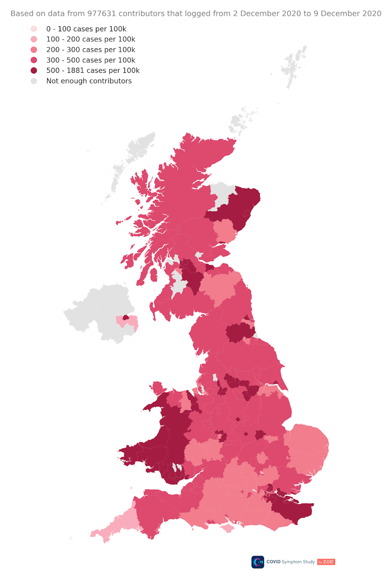
Borough-level Prevalence map of London

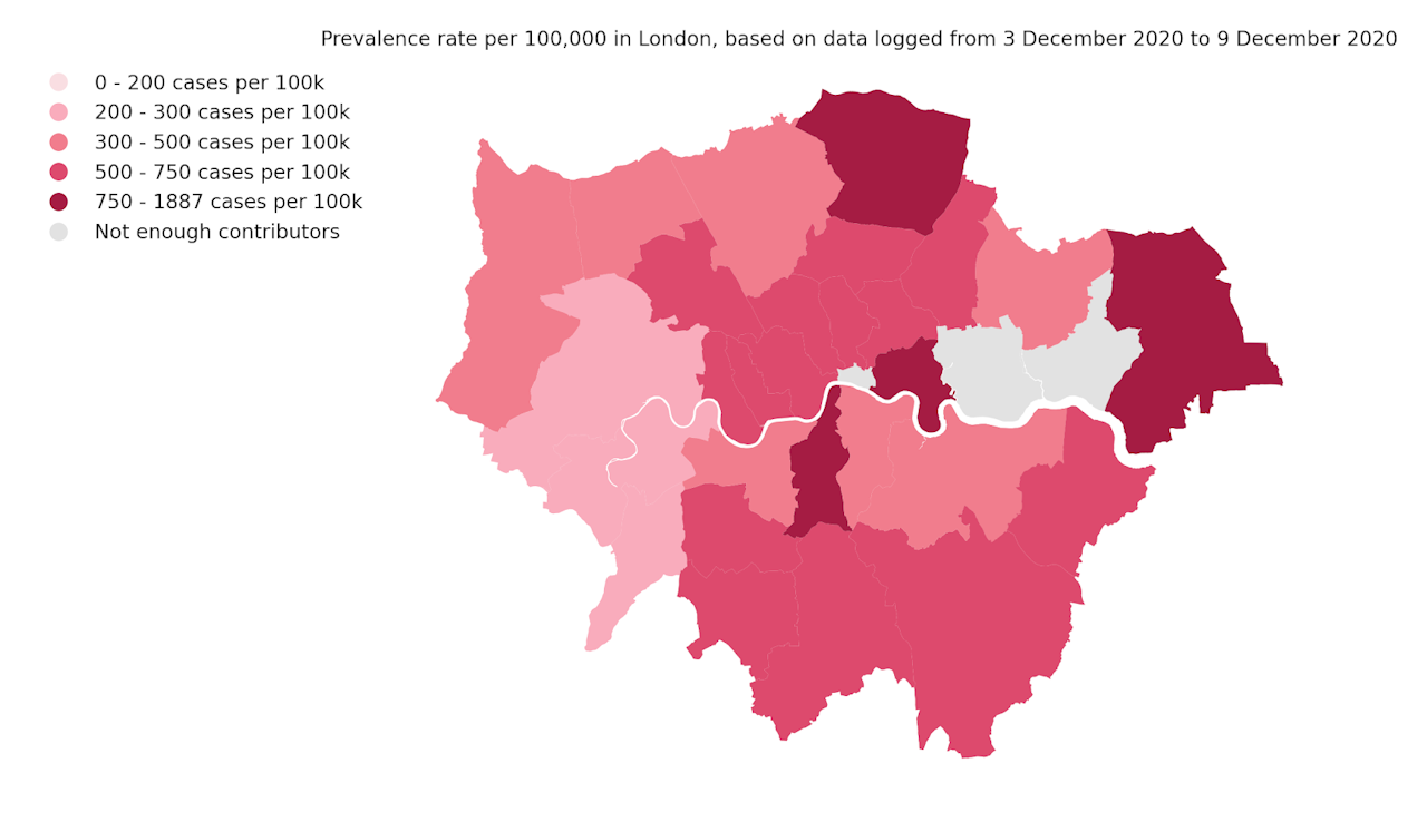
Borough-level prevalence rates in London

The COVID Symptom Study UK Infection Survey results over time for the UK

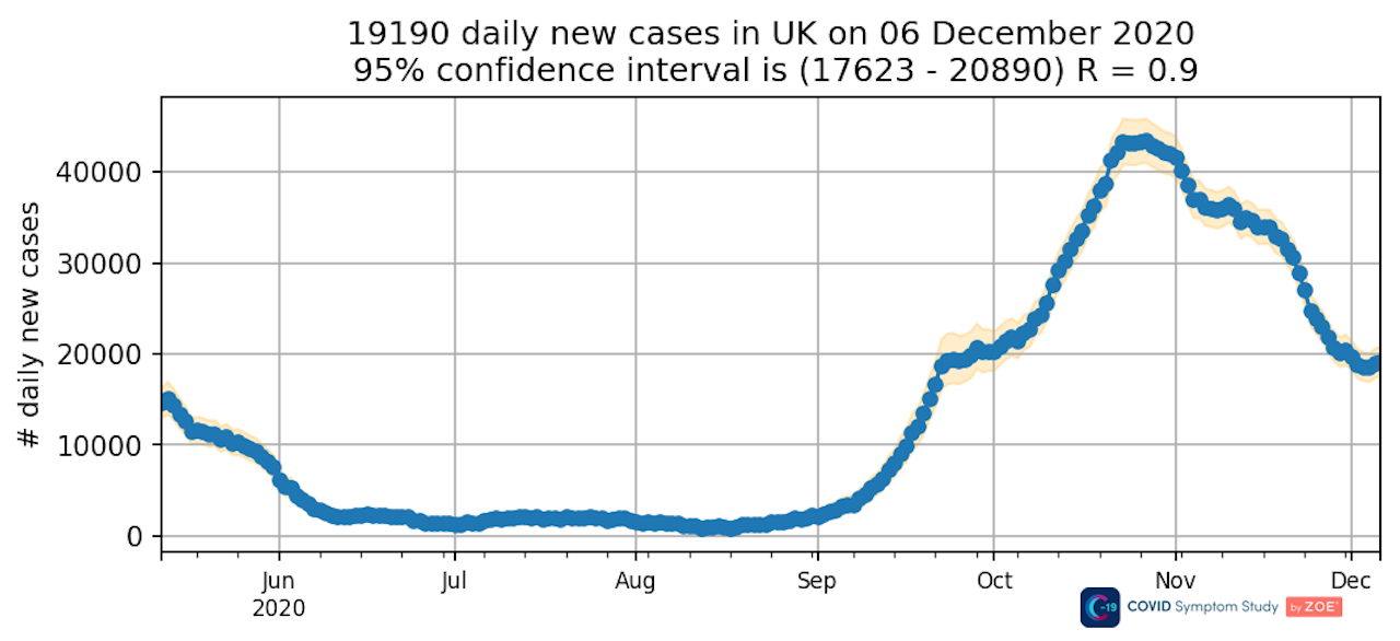
Table of R Values

Map of UK prevalence figures:

Estimated rate of people with Symptomatic COVID across age groups